E-commerce
Probemas redesign
A modern storefront and a loyalty program for a marketplace selling RuneScape gold, items and services.
Overview
Probemas is an online marketplace for Old School RuneScape and RuneScape 3 players: gold, items, accounts and in-game services. The site had grown over ten years into dense, inconsistent pages. I redesigned the storefront and checkout, and designed Reward Chests, a loyalty program where players earn points on every purchase and spend them on chests.
Problem
Probemas had grown for ten years, page by page. Every product type had its own layout, the navigation listed services instead of helping people find them, and checkout took more effort than buying a few million gold should. On top of that, there was little engineering time, so the redesign had to work mostly within the existing back end.
Research
I started with an audit of the old site and a look at the competition: what other RuneScape marketplaces sell, how they present prices, and how they earn trust. A few player interviews and a short survey filled in the rest.
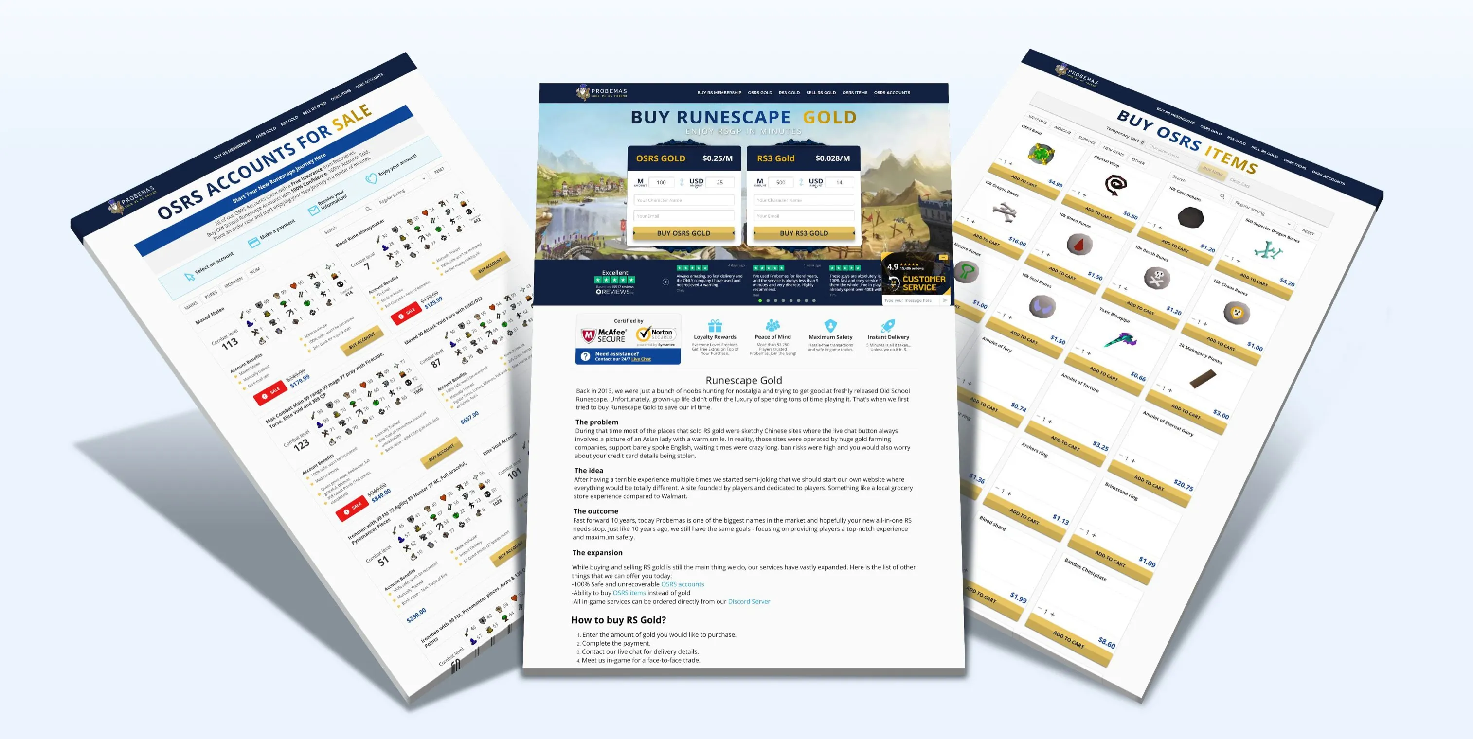
Three problems stood out:
- Outdated, hard-to-scan pages. Long blocks of text, small product cards, and a different layout for every product type.
- Weak product discovery. People who came for one thing, like OSRS gold, had no easy path to items, accounts or services.
- A heavy checkout. Too many fields and steps for what is often a repeat purchase.
Two kinds of players
From the site’s content and its audience, I wrote two proto-personas to keep decisions grounded:
- The returning player (30–45) played RuneScape years ago and came back to Old School. They want to catch up fast and get lost in dense pages.
- The dedicated player (18–35) plays for hours a day and knows exactly what they need. They want the right item quickly and get frustrated by outdated information.
How might we
How might we make Probemas feel as modern and trustworthy as the game’s best fan sites, and give players a reason to come back after the first purchase?
Process
Working within the limits
With limited development resources, I prioritized changes that improved the experience without heavy back-end work: a new visual layer, clearer page structure and reusable components on top of the existing product data and order flow.
A visual language for players
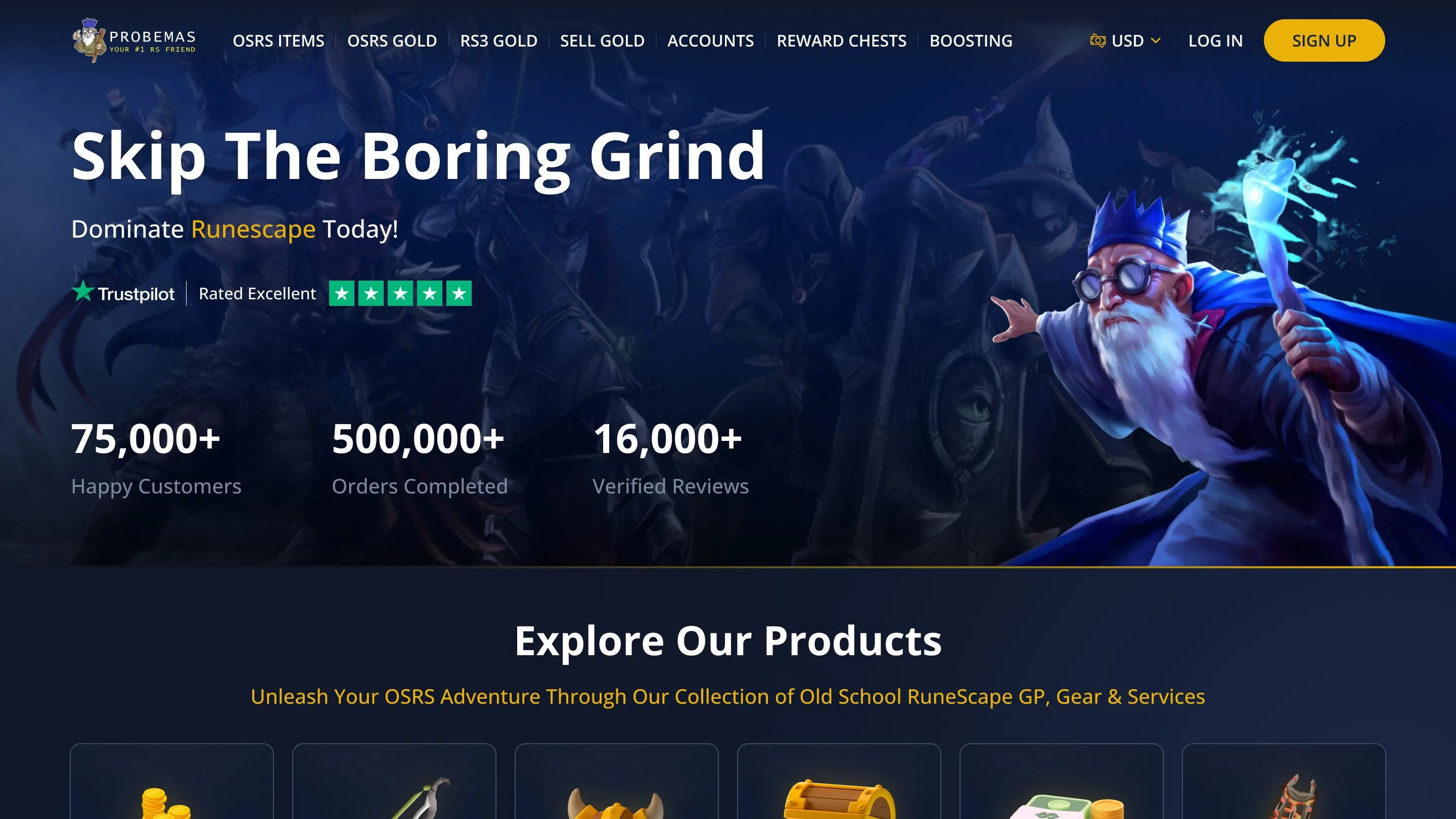
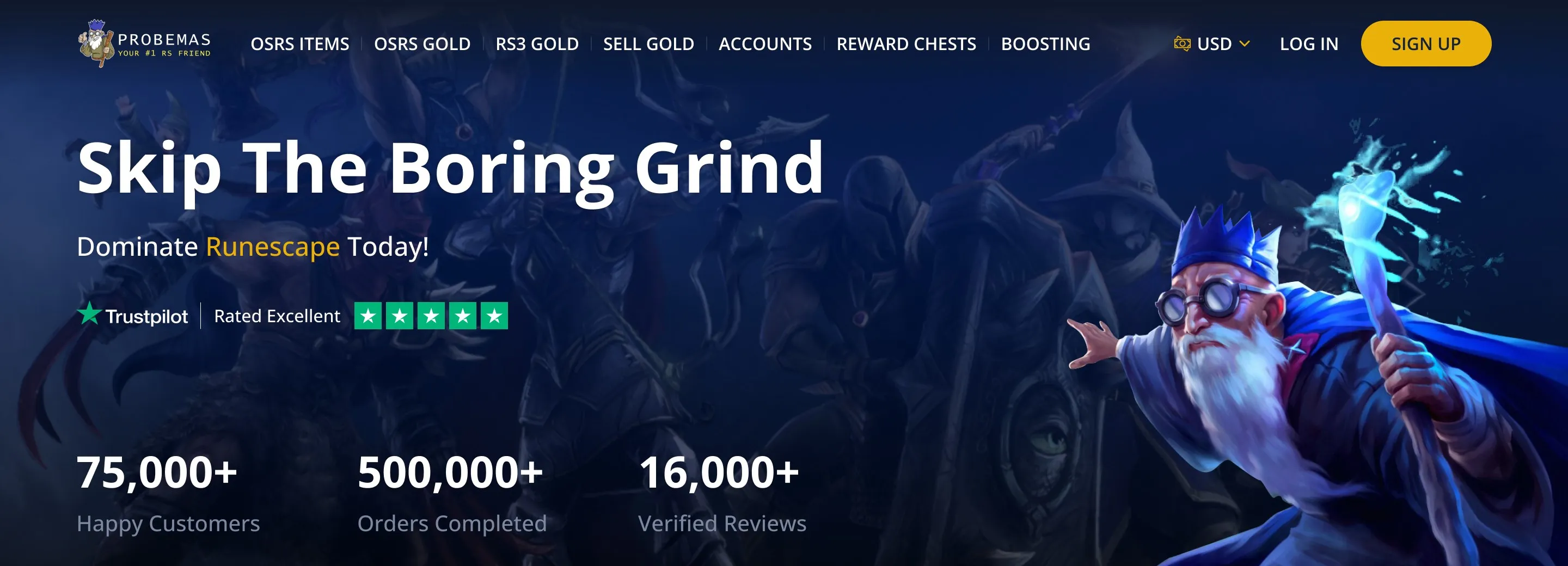
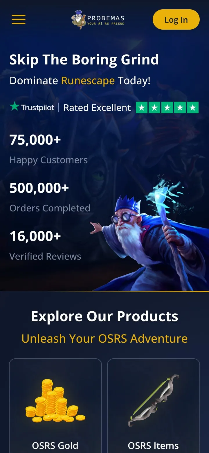
I moved the site from a generic white storefront to a dark, game-inspired look that matches how players see RuneScape: deep navy backgrounds, gold for actions and prices, and character art from the game’s world. One set of components covers every product type, so gold, items, accounts and services finally look like one store.
Solution
A storefront that starts with the products
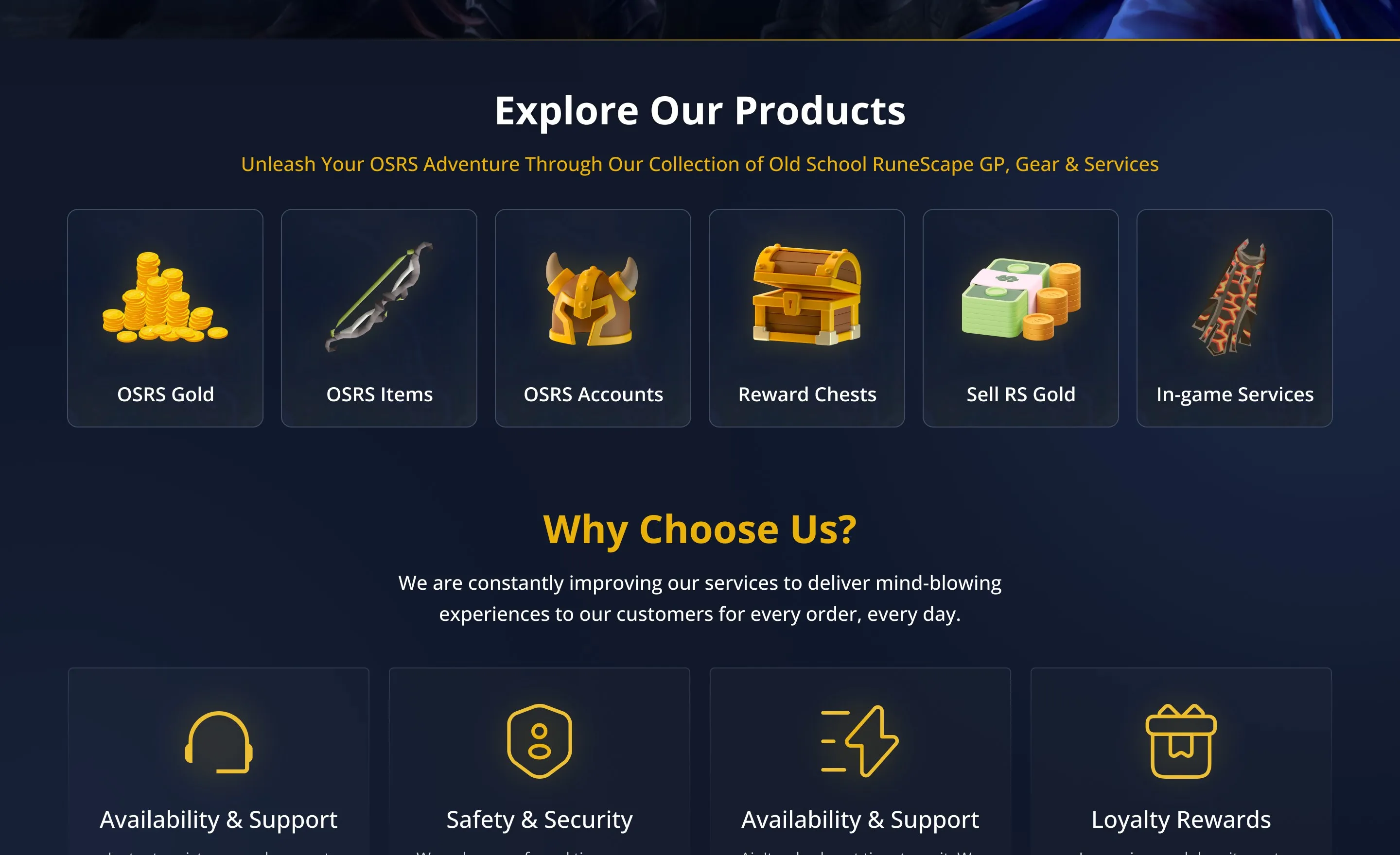
The new homepage leads with a clear promise and trust signals, then sends people straight to the six product types: OSRS gold, items, accounts, Reward Chests, selling gold and in-game services.
Reward Chests
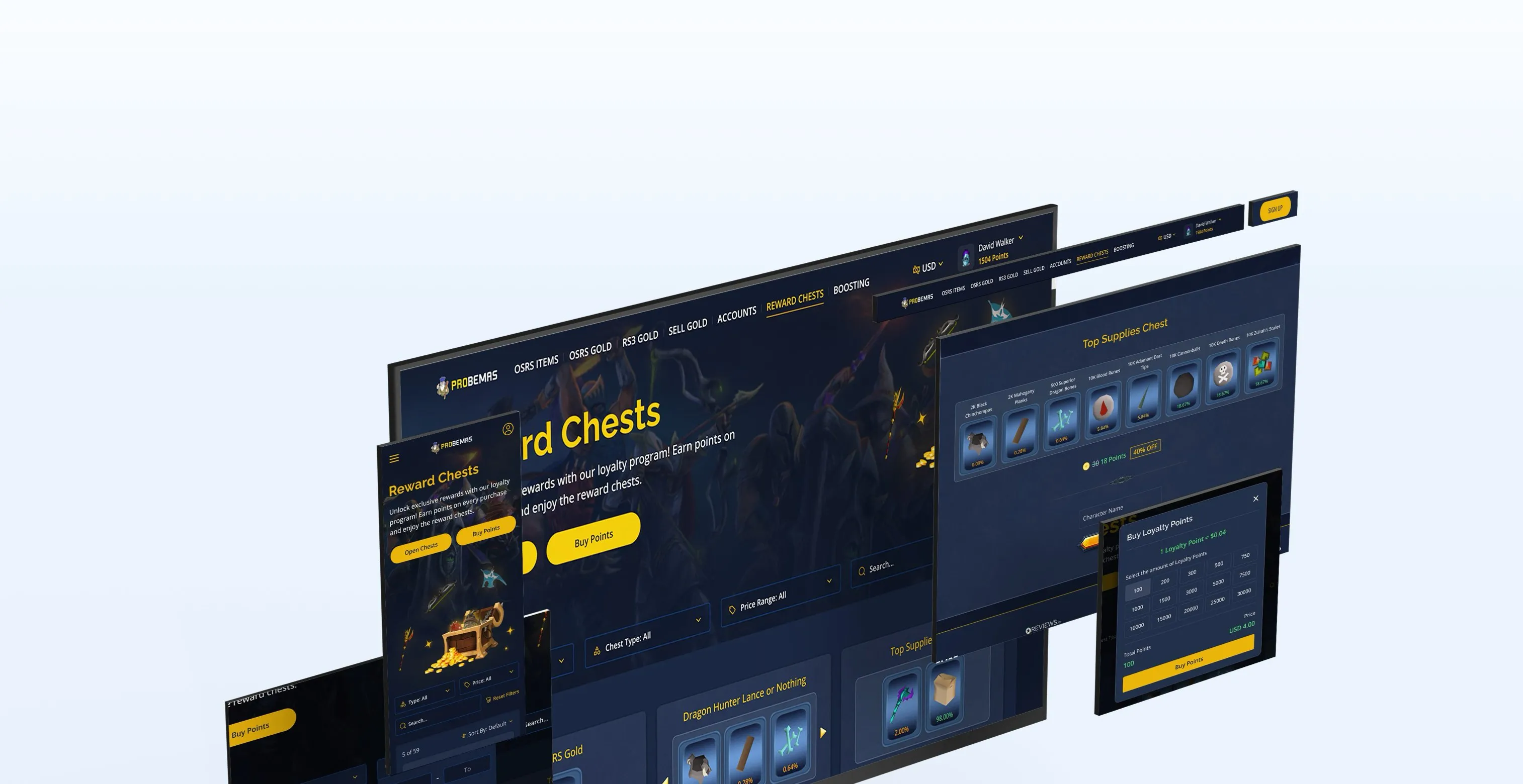
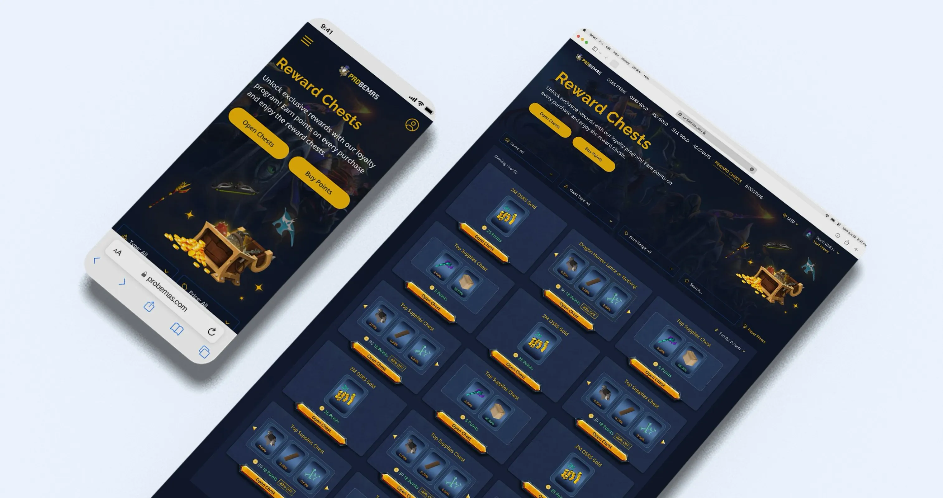
A loyalty program built into the store. Players earn points on every purchase, buy more points if they want, and spend them on chests with gold or items inside. Each chest shows exactly what it can contain and the chance of each prize, and players can filter chests by game, type and price.
A one-page checkout
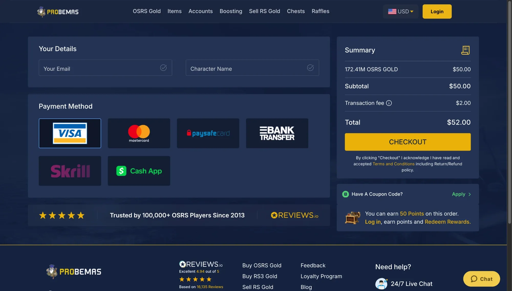
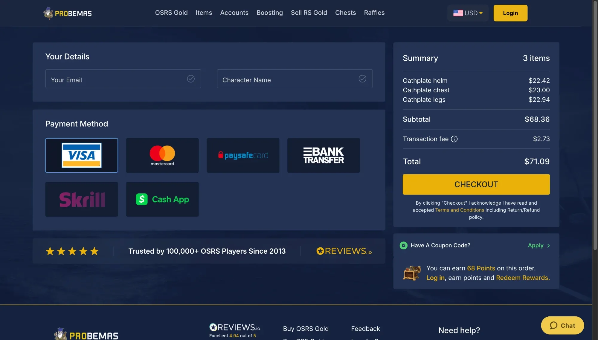
Checkout now fits on one screen and asks for two things only: an email and the character name for delivery. Payment methods are large, recognizable tiles. The summary shows every fee before the button, and the points the order will earn sit right under it, so the loyalty program shows up where players are already spending.
Mobile first-class
Every page, including Reward Chests, has a mobile layout.
Outcome
The redesigned storefront, checkout and Reward Chests went live on probemas.com. Probemas finally had one consistent design across every product type, and a loyalty program that gives players a reason to come back after their first order.
Learnings
- Limited engineering time is a design constraint, not an excuse. Focusing on the visual layer and page structure let the redesign ship without rebuilding the back end.
- In a niche like this, trust is part of the interface. Reviews, delivery times and security belong next to the buy button, not on an About page.
- A loyalty program has to feel fair. Showing every chest’s odds up front was a design decision, not a legal footnote.